AOR Building Supplies
Category
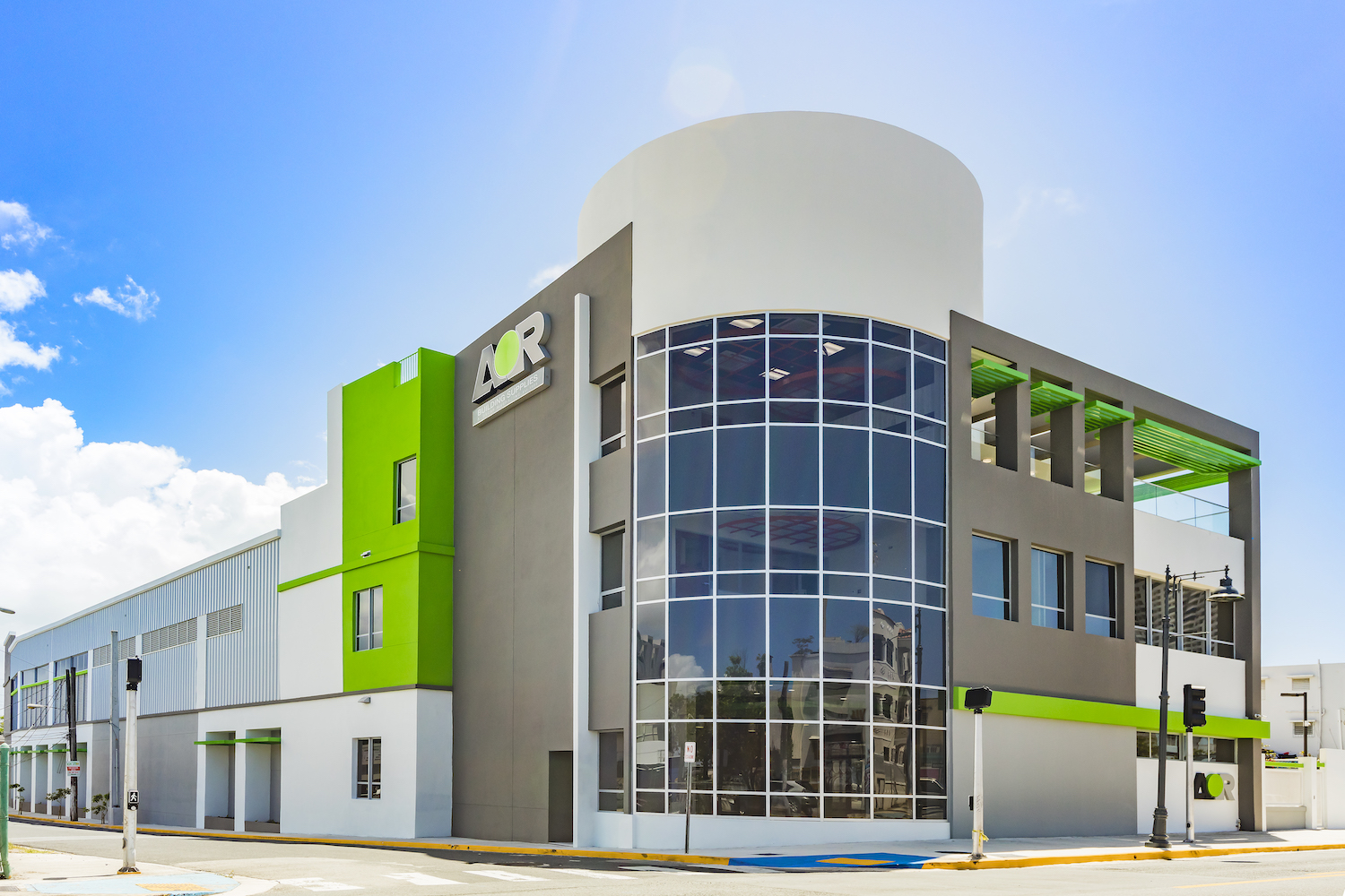
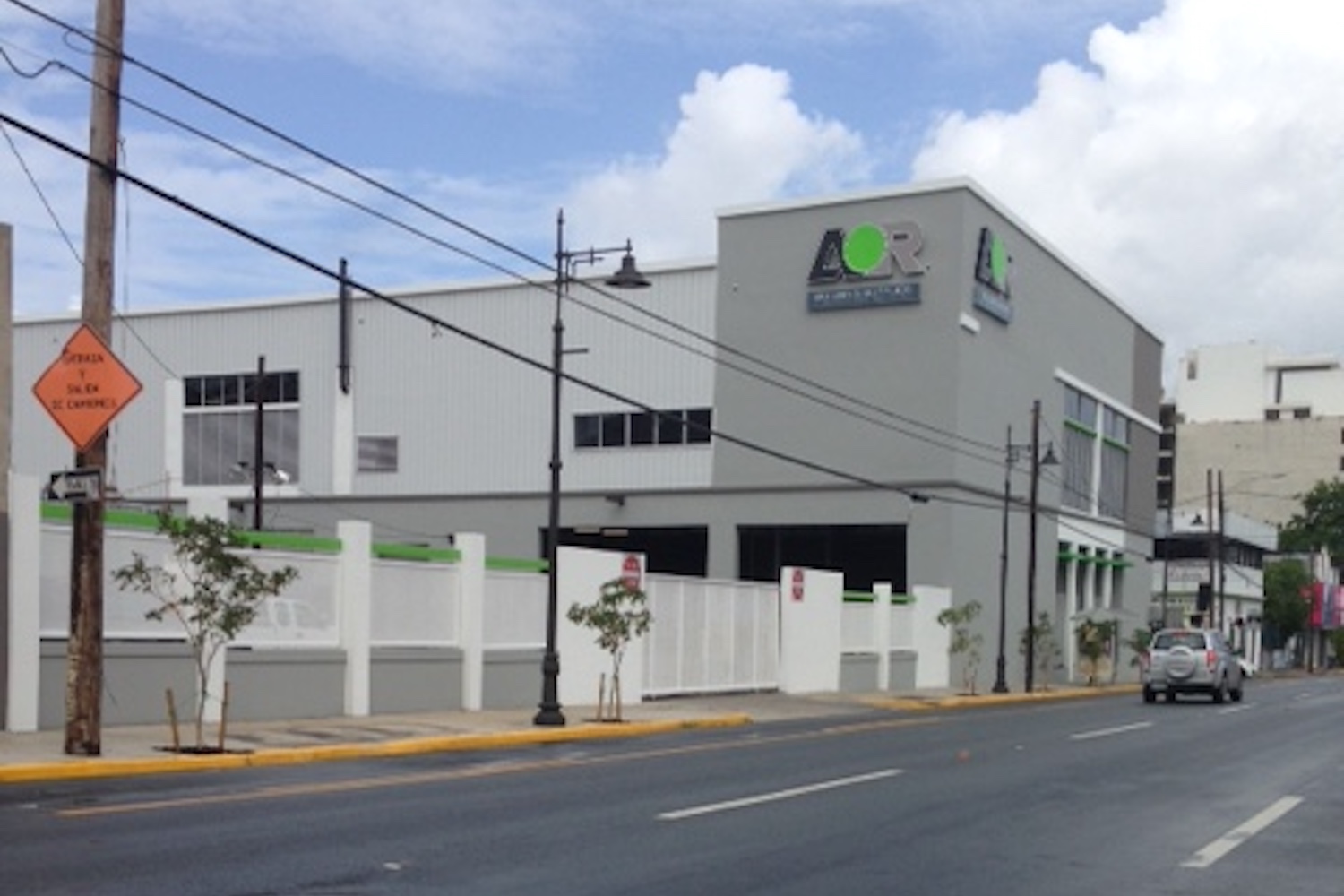
CommercialThe AOR Building Supplies project in Santurce is one of those success stories about the augmented value and enhanced productivity where architecture serves as a key participant. Working closely with the Owner, V Architecture created a new iconic building in a prominent urban corner that fits its immediate context while offering a very functional, easy-access, and productivity-oriented design solution. Immediately after its opening in 2016, having moved from another location that AOR had outgrown, the company experienced increased sales, faster delivery and dispatch times, higher employee satisfaction, improved safety, and better overall productivity. The AOR building is a mixed-use, 56,000-square-foot facility with three stories and a basement. It houses AOR’s headquarters, a generous showroom, an ample loading dock, and a 33,000-square-foot commercial storage space. The building roof carries an array of photovoltaic panels that showcase AOR’s proprietary solar-energy system, SolAORa, that not only generates power for the building but allows the clients to see the system at work first-hand. In addition, the top floor contains a very important feature. AOR wanted a multifunctional space to carry out different activities, the main one being the training of both their employees and the construction contractors to keep them up to date with the best use of the products they sell and distribute. AOR frequently holds seminars, presentations, large meetings, and social gatherings in an adaptable space that even boasts an outdoor terrace. AOR is a construction-supplies outlet and as such, they wanted to highlight the various products, materials, finishes, and equipment that they distribute. Seeing this as an opportunity, V Architecture outfitted the new spaces using various lines of their products and systems.
The project thus exemplifies the use of architecture as an effective marketing tool. The V Architecture design team was able to use the very restrictive Santurce Special Zoning Regulation to the project’s advantage, particularly in terms of the building’s aesthetics. The zoning parameters called for special attention to the public space, setbacks, cornice lines, street alignments, façade treatment, and mass fragmentation to fit and enhance the existing (and desirable) urban rhythm of its surroundings. The design resulted in a solution where the building is not read immediately as just a warehouse but rather plays with planes, volumes, lines, and colors in proportion to its site. This, ultimately made for a successful design to the complete satisfaction of AOR and its clientele.


